Using Data Grids

This resource introduces data grids in Pulse. Users will learn what they are and how to use them to create and export custom reports.

What is a Pulse Data Grid?

Data grids in Pulse are organized, easy-to-navigate tools to help you view, manipulate, modify, sort, and filter important data. Data grids serve as instant reports allowing you to customize the information you would like to display and export.

Click the Play button below to view What is a Data Grid, and How Can I Use It in Pulse?

Run Time: 03:42 

In this article, the following information regarding Pulse data grids is covered:

Accessing Data Grids

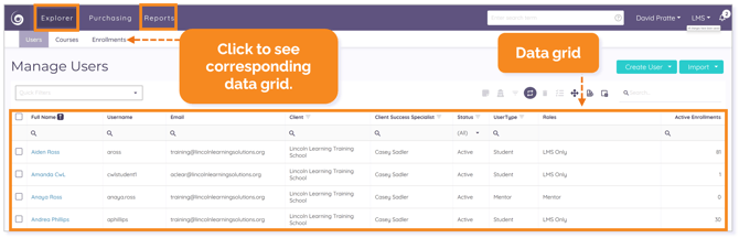
Each Explorer and Reports tab in Pulse contains a default data grid.

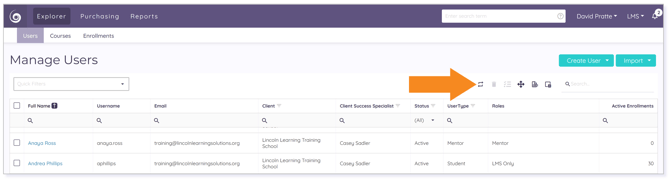
NOTE: For this article, we will use the Explorer tab for images and references. 

Click Users, Courses, or Enrollments to see the corresponding data grid.

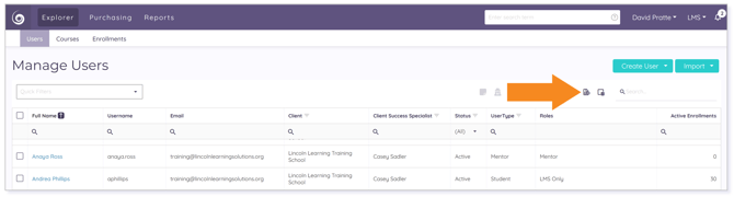
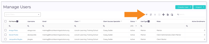
Data Grid Options and Controls

The following data grid options and control icons may be found above the data grids.

Some of the data grid options and control icons are:

NOTE: If an icon is gray, it does not function at that time. Icon functionality can change as you customize your data grid.
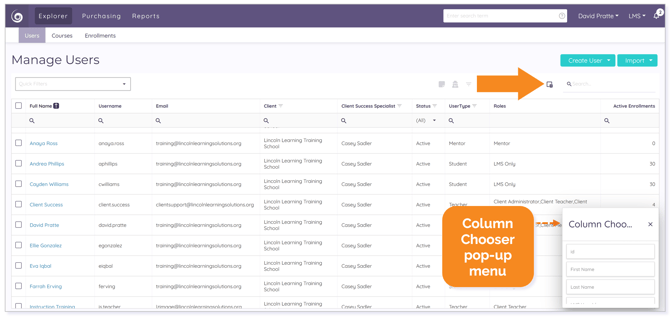
Column Chooser

Use the Column Chooser icon to personalize the columns displayed in the data grid.

Export All Data

Once you have customized your columns, filtered, and sorted, you can export your selected data to an Excel spreadsheet using the Export all data icon for reporting purposes.

TIP: Use the checkbox(es) to select specific rows for exporting.

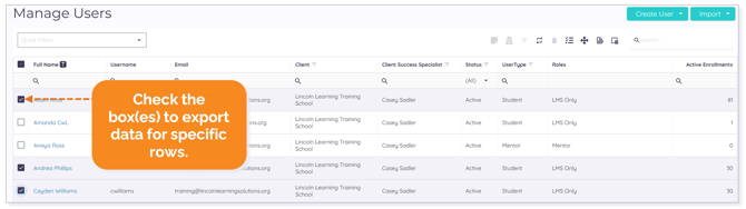
WARNING: If you don't see all expected exported data, check to make sure you haven't selected specific rows for export.

Clear All Filters

Clear filtered details at any time by clicking the Clear All Filters icon.

TIP: Before using any data grid, Clear All Filters to speed up navigation.

Restore Default Table Settings

Return to the default display at any time by clicking the Restore Default Table Settings icon.

Customizing Data Grids

Customizing data grids in Pulse can be done in a variety of ways. Four of these customization options are:

  1. Searching
  2. Filtering
  3. Sorting
  4. Adjusting Columns

Searching

You can search in the Users, Courses, or Enrollments tab by using the main Search field or by searching per column.

Once you begin to type into the main Search field, an X appears. Click the to clear your search and restore the full list.

To search within each column on the data grid, begin typing in the Search field for that column, and your results will come to the top of the grid.

Filtering

Filtering is a way to display information meeting the criteria you specify and hiding information you do not want to be displayed. 

Quick Filters

To quickly filter a Users, Courses, and Enrollments data grid, use the Quick Filters tool and select an option from the drop-down menu.

IMPORTANT: The options available in each tab’s Quick Filter are unique to that tab and your specific user permissions. 

Once a filter is applied, all data specific to that filter displays.

TIP: To clear the Quick Filters, click the X next to the Quick Filter dropdown. 


Column Filters

Applying column filters further allows you to customize your data grid to the information you want to see. 

NOTE: Filtering options are different within Users, Courses, and Enrollments. This example shows filtering options within Users.

You can filter multiple columns and multiple criteria within columns to narrow your list.

EXAMPLE: If you only want to see users with the Teacher user type, click the filter icon in the User Type column and use the checkbox to select Teacher from the drop-down menu. Then, click OK or Cancel.

Clicking on the magnifying glass in any Search field within a column populates a drop-down menu of options that help you to further filter your column.

Clicking on any drop-down menu option within a column populates a list of options that can also help you to further filter your data grid.

TIP: Click the Clear All Filters icon to clear your filter(s).

Sorting

All columns in Explorer within the Users, Courses, and Enrollments tabs can be sorted in either ascending or descending order by clicking on the column title, which arranges elements in the sorted list alphabetically (i.e., A to Z for ascending order, Z to A for descending order) or numerically (i.e., lowest to highest for ascending order, highest to lowest for descending order).

Click the column title once for ascending order (up arrow). Click it twice for descending order (down arrow).

IMPORTANT: The sorting arrow appears after clicking on a column title. Otherwise, it remains hidden.

Adjusting Columns

Customizing your columns by adjusting them will allow you to easily see all desired information in the data grid. Three ways to adjust columns in Pulse are:

  1. Resizing Columns
  2. Rearranging Columns
  3. Adding and Removing Columns

Resizing Columns

To expand a column, hover over the column header and move your mouse to the right edge of the header until you see a double line with an arrow pointing outward in either direction. Then, drag the header to the right until the column expands. To collapse the column, drag the header to the left.


NOTE: The header changes color as you hover over it to indicate it is selected.

Rearranging Columns

To rearrange a column, click any column header, drag it to your desired location on the grid and drop it.

The column now displays in the new location on the grid.

Adding and Removing Columns

Explorer includes a Column Chooser tool allowing you to select which columns you wish to have visible in a data grid, letting you personalize the display and customize data for exporting and reporting.

Activate the Column Chooser and scroll down the pop-up menu to see more options.

To add a column to the data grid, drag it from the menu to your desired location on the grid. To remove a column and hide it from view in the data grid, drag the column by the header name to the Column Chooser menu.

TIP: To close the Column Chooser tool, click the X.

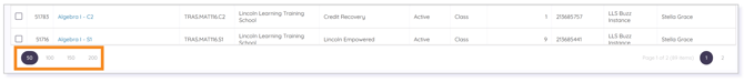
Additional Data Grid Tips

To prevent lag when loading results in a data grid, set the results per page in the bottom-left to fewer than 200.

Right click on any hyperlink to populate a drop-down menu of options.

Please note the images found in this resource may not match your screen. Access and/or features may vary based on client contract.

© 2024 Lincoln Learning Solutions. All rights reserved.